acrylic color mixing guide
Acrylic color mixing is a versatile art form rooted in color theory, allowing artists to create vibrant hues by blending primary colors into secondary and tertiary shades, unlocking endless creative possibilities․
1․1 Understanding the Basics of Color Theory
Color theory forms the foundation of acrylic mixing, explaining how colors interact․ It begins with primary colors—red, yellow, and blue—which cannot be created from other hues․ Mixing primaries yields secondary colors: orange (red + yellow), green (yellow + blue), and violet (blue + red)․ This fundamental knowledge helps artists predict color outcomes and create harmonious palettes for their work․
1․2 Importance of Color Mixing in Acrylic Painting
Color mixing is essential in acrylic painting as it allows artists to create unique hues, enhance compositions, and express creativity․ By blending colors, painters can achieve specific shades, textures, and moods, reducing the need for multiple paint tubes․ This versatility enables artistic freedom, experimentation, and efficiency, making color mixing a cornerstone of acrylic artistry․
Essential Color Mixing Tools and Materials
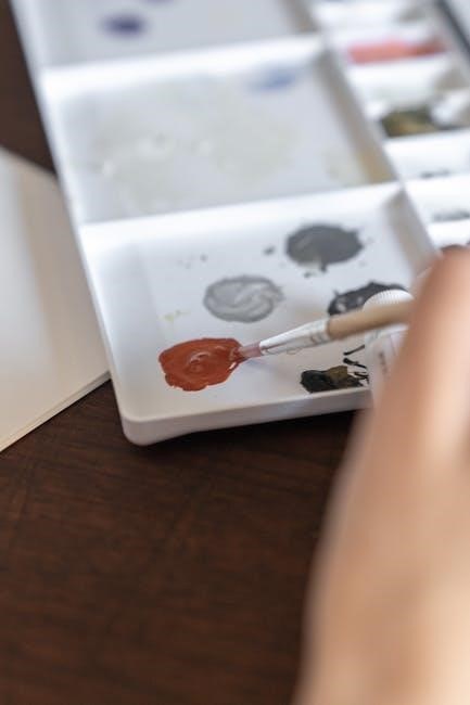
High-quality acrylic paints, a variety of brushes, a sturdy palette, water cups, paper towels, and a color mixing chart are must-have tools for effective color blending․
2․1 Must-Have Paints for a Basic Acrylic Palette
A basic acrylic palette should include high-quality primary colors like Cadmium Red, Cadmium Yellow, and Phthalo Blue․ These primaries are indispensable for mixing secondary and tertiary hues․ Additionally, include Titanium White for creating tints and a deep black for shades; Earth tones like Burnt Sienna and Raw Umber add versatility for natural and skin tones․ These essentials form the foundation for limitless color creation and experimentation․
2․2 Brushes, Palettes, and Other Necessary Supplies
Invest in a variety of high-quality brushes, including flat, round, and filbert styles, to achieve different effects․ Use a sturdy palette with built-in wells for organizing paints․ Essential supplies include water cups, paper towels, and a spray bottle to keep paints moist․ Optional tools like palette knives and sponges can enhance texture and blending․ These basics ensure efficiency and creativity in your acrylic color mixing process․
Primary, Secondary, and Tertiary Colors
Primary colors (red, yellow, blue) form the foundation of mixing․ Secondary colors (orange, green, violet) are created by blending primaries․ Tertiary colors add depth through subtle variations, enhancing artistic expression․
3․1 Mixing Primary Colors to Create Secondary Hues
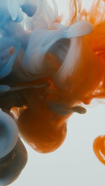
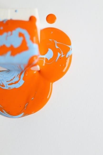
Mixing primary colors—red, yellow, and blue—creates secondary colors: orange (red + yellow), green (blue + yellow), and violet (blue + red)․ This fundamental process demonstrates color theory basics, allowing artists to expand their palette and achieve vibrant, harmonious hues․ Understanding these combinations is essential for mastering acrylic color mixing and creating dynamic, balanced artworks․
3․2 Exploring Tertiary Colors for Depth and Variety
Tertiary colors, created by mixing primary and secondary hues, add depth and variety to artwork․ Examples include yellow-green, blue-green, red-orange, red-violet, and yellow-orange․ These colors enrich compositions by introducing subtle nuances and complexity․ Artists can use color wheels to identify tertiary shades, ensuring harmonious blends that enhance the visual appeal of their acrylic paintings․ Experimenting with these hues expands creative possibilities and refines artistic expression․
Understanding Color Bias and Undertones
Color bias refers to the undertones in paints, such as warm or cool hues, influencing mixtures․ Understanding these undertones is crucial for achieving desired colors in acrylics․
4․1 What is Color Bias and How Does it Affect Mixing?
Color bias refers to the inherent undertones in pigments, such as warm or cool hues, that influence how colors mix․ Understanding these undertones is key to predicting mix results, as they can shift the final color significantly․ For example, a yellow with a green bias will mix differently than one with an orange bias․ Recognizing these biases helps artists achieve consistent and harmonious color outcomes in their acrylic work․
4․2 Identifying Warm and Cool Colors in Acrylics
Warm colors, like oranges and reds, evoke warmth and energy, while cool colors, such as blues and greens, create calming effects․ Identifying these properties helps artists achieve desired moods in their work․ Warm pigments tend to advance visually, while cool ones recede, enabling dynamic composition․ Understanding this contrast is essential for creating balanced and visually appealing acrylic pieces․
Creating a Color Mixing Chart
A color mixing chart helps organize and track your acrylic color combinations, allowing you to experiment and reference your creations efficiently for future projects․
5․1 How to Organize Your Chart for Maximum Efficiency
To organize your color mixing chart effectively, list your paint colors along the top and side of the grid․ Mix each combination and paint a swatch where the rows and columns intersect․ Label each cell clearly and use symbols or keys to note color ratios or additional details․ Include tints, tones, and shades for depth, and consider complementary color pairs for harmony․ This structured approach ensures easy reference and inspires creativity․

5․2 Benefits of a Color Mixing Chart for Artists
A color mixing chart offers immense value to artists by providing a visual guide for creating over a million hues․ It saves time and money by reducing the need for multiple paint tubes․ The chart enhances color theory understanding, aids in achieving consistency, and helps in experimenting with harmonious color schemes․ It also simplifies the process of recreating specific shades, ensuring efficiency and precision in acrylic painting projects․
Advanced Color Mixing Techniques
Explore advanced methods like mixing tints, tones, and shades, creating custom hues for skin tones and landscapes, and mastering vibrant and neutral color combinations effortlessly․
6․1 Mixing Tints, Tones, and Shades
Mixing tints, tones, and shades enhances your artwork by adding depth and dimension․ Tints are created by adding white to a base color, while tones are made by mixing with gray․ Shades are formed by adding black, darkening the hue․ This technique allows for subtle variations, enabling artists to achieve soft, muted, or dramatic effects, perfect for capturing light, shadow, and mood in acrylic paintings․
6․2 Creating Custom Colors for Skin Tones and Landscapes
Custom colors for skin tones and landscapes require precise mixing․ Skin tones often blend warm primaries with touches of Burnt Sienna or Ochre for realism․ For landscapes, muted greens and blues are mixed to capture natural hues․ Layering and blending techniques enhance depth, allowing artists to achieve lifelike skin tones and atmospheric landscape colors with ease and precision․
The Role of the Color Wheel in Mixing
The color wheel is a fundamental tool for understanding color relationships, enabling artists to identify complementary and analogous hues for harmonious mixes in acrylic painting․
7․1 How to Use the Color Wheel for Harmonious Mixes
Start by identifying primary colors on the wheel, then mix them to create secondary hues․ Use complementary colors (opposite each other) for vibrant contrasts or analogous colors (next to each other) for smooth transitions․ Warm colors (red, orange) and cool colors (blue, green) balance each other․ Experiment with these relationships to craft harmonious color schemes in your acrylic paintings, ensuring visual balance and emotional impact in your work․
7․2 Exploring Complementary and Analogous Colors
Complementary colors, situated opposite each other on the color wheel, create striking contrasts when paired, enhancing vibrancy․ Analogous colors, located side by side, produce smooth transitions and harmony․ Experimenting with these combinations allows artists to add depth, balance, and emotional resonance to acrylic paintings, making color selection a deliberate and impactful part of the creative process for stunning visual results․
Tips for Mixing Bright, Dull, and Neutral Colors
Mastering bright, dull, and neutral colors in acrylics involves adjusting pigments with white, black, or complementary mixes․ Layering and glazing techniques can enhance or mute hues effectively․
8․1 Achieving Vibrant Colors with Acrylics
To achieve vibrant colors with acrylics, use heavy-body paints with high pigment loads․ Mix complementary colors in small amounts to intensify hues․ Avoid over-diluting with water, as this can dull the color․ Instead, use glazing techniques by layering transparent washes over base colors for deep, rich tones․ Experiment with bold brushstrokes and textured applications to enhance vibrancy and create dynamic visual effects in your artwork․
8․2 Techniques for Muting and Neutralizing Colors
To mute or neutralize colors, mix complementary hues in small proportions or add touches of black, white, or gray․ For softer tones, incorporate a base of titanium white or medium to dilute vibrant pigments․ Experiment with glazing techniques by layering transparent washes over dried colors for subtle, nuanced shifts․ This approach creates balanced, harmonious palettes ideal for realistic or subdued artistic expressions in acrylic painting․
Common Mistakes in Acrylic Color Mixing
Overmixing, ignoring color bias, and adding too much water are frequent errors․ These mistakes can muddy hues, dilute pigments, and compromise color purity, affecting final results negatively․
9․1 Avoiding Overmixing and Maintaining Color Purity
Overmixing can dull colors and reduce vibrancy․ To maintain purity, mix paints briefly and in small increments․ Use separate palettes for each color to prevent cross-contamination․ Avoid adding too much water or medium, as this can dilute pigments․ Instead, mix intentionally, testing swatches on a neutral surface to ensure desired hues․ This approach preserves the intensity and clarity of your acrylics, enhancing the overall impact of your artwork․
9․2 Troubleshooting Unwanted Color Shifts
Unwanted color shifts often occur due to undertones in paints or environmental factors․ To address this, create a color mixing chart to track your mixes accurately․ Test swatches on a neutral surface before applying to your artwork, as acrylics may dry slightly darker․ Adjust your mix in thin layers, allowing each to dry before adding more․ This ensures predictable results and minimizes unexpected color changes, helping you achieve the desired hues effectively․
Resources and Further Learning
Explore in-depth guides like Jackie Garner’s color mixing guide and online tutorials for acrylic artists․ Recommended books include The Art of Color Mixing and Color Theory Essentials, offering practical tips and techniques for mastering acrylic color mixing․
10․1 Recommended Books and Guides for Color Mixing
Discover essential resources like The Art of Color Mixing and Color Theory Essentials, offering practical tips for acrylic artists․ Online guides, such as Jackie Garner’s in-depth color mixing guide, provide detailed techniques․ Explore Pinterest boards like Gina Redmore’s colour mixing chart for visual inspiration․ These resources cover color theory basics, advanced mixing techniques, and creative applications, helping artists of all levels expand their skills․
10․2 Online Tutorials and Communities for Acrylic Artists
Expand your skills with online tutorials and vibrant artist communities․ Explore platforms like Pinterest, where boards such as Gina Redmore’s colour mixing chart inspire creativity․ Join forums and social media groups dedicated to acrylic painting, where artists share techniques and feedback․ Websites offering step-by-step guides, video tutorials, and interactive color mixing tools provide endless resources for mastering acrylic color techniques and staying connected with fellow artists․